The following article summarizes my Master’s research and is adapted from several presentations I’ve given on the topic. It concisely covers the study’s context, motivations, and key findings. For more details and any citations you wish to do, please refer to the original document. If you have any questions feel free to get in touch, I would love to talk to you and help out.
First, a bit of context
Back in August 2025, following the completion of the first year of my Master’s program, I had to make a decision regarding what I wanted to do in the following year. My first hindrance involved deciding between pursuing an internship, a project, or a dissertation.
While this choice was inherently difficult and presented a challenge for many of my colleagues, I recognized immediately that I wanted to undertake the commitment of writing a dissertation and conducting comprehensive research into a specific subject.
Whilst that part was fairly straightforward, selecting the focus of that research would be a bit more challenging. Something that you need to know about me is that I’m a naturally curious person and because of that I naturally have many interests and, more often than not, I find myself deep into random rabbit holes.
So, I took a step back and focused on a few areas that in some way, shape, or form I believe were and still are central to my practice and personal interests: type design, accessibility, and technology.
Trying to explain to you every single one of these, and what they mean to me, would probably be its own rabbit hole, but what I’m trying to say is that in some way, shape, or form I had been trying, and wanted to continue to try, to develop work that belonged somewhere in these three domains.
I was particularly interested in the possibility of using computational tools not simply to automate design, but to give designers new ways of understanding how their decisions might affect people with different visual conditions. This led me to the broader question of whether computational simulation could become part of an accessible type-design process.
Somewhere along all of these thoughts is where I found an article titled “VI-OCR: ‘Visually Impaired’ optical character recognition pipeline for text accessibility assessment”. The article dives into a pipeline called VI-OCR that, as proposed by Gao et al. (2025), aims to simulate visually impaired vision, mimicking human text recognition aptitude under specified levels of visual acuity and contrast sensitivity loss.
I was immediately intrigued by this article, it was fairly fresh research that proposed a tool that, at least in my head, would be extremely interesting for type designers and researchers that focus on accessibility. So, as any curious person would, without thinking much about it, I wrote an email to Dr. Yingzi Xiong and Dr. Qingying Gao, from Johns Hopkins University, with a few questions about their tool and how it worked. Afterwards, I talked with my supervisor, Professor Pedro Amado, about it and proposed to both him, Dr. Xiong, and Dr. Gao to conduct research into VI-OCR, analyzing its performance against visually impaired people.
Why does this matter?
According to the World Health Organization (2019), at least 2.2 billion people globally have some type of vision impairment. This makes visual accessibility not just a niche design concern, but a problem affecting a very large part of the global population.
The written word is the primary vehicle for information, education, and civic engagement, the ability to read efficiently is a foundational component of modern life. Designing for inclusion recognizes that the general population is not homogenous (Holmes, 2018), particularly concerning visual function, which can be altered by various conditions leading to visual impairments.
Today, more than ever, we live in a world where there’s a necessity to create products that fulfill more than just artistic expression. Functionality, accessibility, and social inclusion (Beier, 2012; Holmes, 2018) are more and more substantial reasons that move companies to innovate, adapt, and push forward new products into the market. This transition positions the creation of type not just as a craft, but as an act of digital system design aimed at eliminating barriers to information access for a visually diverse population (Napoleão, 2021). This motivation is fundamentally rooted in the recognition that legibility is not a monolithic concept, but a spectrum dictated by individual visual, cognitive, and environmental conditions.
Typeface legibility is ultimately a question of human perception. When we design for people with visual impairments, the most reliable way of evaluating whether a typeface works is to test it with people who actually experience those visual conditions.
Of course, if you are familiar with usability testing of any kind, you know this creates a significant practical problem. Recruiting appropriate participants, controlling experimental conditions, conducting repeated tests, and accounting for individual differences makes this type of research resource-intensive and difficult to scale.
This becomes particularly relevant when we consider the number of possibilities available in contemporary type design, especially with variable fonts and increasingly iterative design processes. Essentially, it takes a long time to test the legibility of a typeface with visually impaired people, and to add to that, it’s very intense and demanding for those individuals.
VI-OCR could be a way for researchers and type designers to accelerate their test protocols, reduce participant fatigue, and in turn help to create more accessible typefaces and systems.
Research Problem
By this point you are probably understanding where this is going, as I’ve already explained a few nuances that frame this research and the main research problem.
So, as presented in my dissertation, the main research question is as follows:
“To what extent do the legibility metrics generated by the VI-OCR computational simulation pipeline reliably correlate with data obtained from human participants using a test protocol based on Larson’s research?”
In simpler terms, I wanted to know whether the computer could fail in a way that was sufficiently similar to a person with visual impairment. My hypothesis was that the VI-OCR recognition errors would strongly correlate with the errors made by human participants under comparable conditions.
Regarding the test protocol based on Larson’s research, I will explain it in the methodology section of this article, but the goal was to use a well-known, well-researched testing methodology that could be applied to the visually impaired participants and to the VI-OCR pipeline.
Operational Goals
I then divided this main question/research problem into four operational questions/goals:
- Implementation: Could I actually implement and adapt the VI-OCR pipeline?
- Correlation: How closely would its recognition errors correspond to human errors?
- Workflow Integration: Could the pipeline realistically fit into a type-design workflow, and how?
- Industry Adoption: Is there actually interest in this kind of computational tool within the type-design community, and what barriers might exist to its adoption?
Literature
I don’t want to really bore you with the literature, so please, if you want to know more, I encourage you to read the original document. With this said, it’s almost obligatory to write this article without forgetting to mention key authors and their respective works.
I chose to divide the literature review of my dissertation into four main areas:
- Type Design: Defined by its historical evolution and structural principles, as framed by foundational literature including Noordzij (2005 [1985]), Unger (2018), and Lupton (2010), while drawing on Cheng (2006) to establish the specific anatomical properties that comprise a typeface’s visual system.
- Accessibility: Transitions from typographic structure to functional usability, focusing on human diversity with research by Holmes (2018). It also defines the individuals with Low Vision relevant to this study according to the World Report on Vision (World Health Organization, 2019), and looks at research by Beier and Larson to understand concepts such as foveal fixations, saccades, crowding effect, and compensatory design choices tested through letter sequences like trigrams.
- Legibility Assessment in Type: Expands on the research done by Beier and Larson, looking into the scientific concepts that relate to their research.
- Computational Simulation Models: Studies VI-OCR and other relevant research into this subject.
What is VI-OCR?
Ok, by now you’ve read all of this and you’re probably thinking: What is VI-OCR?
VI-OCR is a software pipeline built using the Python programming language and libraries that can be divided into two parts:
- Image Filtering: In the first part, an image with text is filtered. This filtering uses an algorithm that changes how the filter is applied by adjusting the
HShift,VShift,Distance to monitor,Monitor size, andScreen Sizeproperties, mimicking real subject test conditions.
- AI-Powered Recognition: The second part of the pipeline uses optical character recognition (OCR) technology powered by artificial intelligence models (such as Gemini) to try to recognize the text in the image, outputting what it sees, much like a visually impaired person telling you what they see on the screen.
Methodology
By utilizing a quasi-experimental quantitative approach, the main goal was to build two datasets:
- Dataset 1: Utilizing a convenience sample through a direct collaboration with ACAPO in Porto.
- Dataset 2: Utilizes the VI-OCR pipeline.
The goal was to get enough data to run a quantitative analysis comparing VI-OCR results against participant results.
Before explaining the test protocol, it’s important to explain that it’s impossible to test every single condition, every single typeface, and every scenario. With this in mind, we defined the universe of our testing as all visually impaired people defined by the World Health Organization as belonging between the mild and severe visual impairment groups (visual acuity in the better eye between 6/12 and 6/60). We also trusted ACAPO as an authority regarding the recruitment of participants that fit our needs, in this case, we wanted participants of Portuguese origin with visual impairments within these delimitations. It’s also worthy to note that these visual conditions are variable.
Building Dataset 1 (Human Participants)
For Dataset 1, we utilized an adaptation of the staircase procedure utilized by Larson and Carter (2016) in the development of Sitka. Usually, this staircase approach, as documented by them, uses time as part of testing. Since time wasn’t a usable metric to compare with the VI-OCR pipeline, we opted to do the staircase procedure logic with size in points.
We used 4 different typefaces that represent different styles and characteristics:
- Sitka
- Luciole
- Arial (Monotype/Microsoft 5.01 version)
- Times New Roman (Monotype/Microsoft 5.01 version)
We presented these typefaces to the participants across 60 trigrams (3 non-word letters) ranging from 120 to 24 points. We showed them a trigram for a brief moment, changed slides to a neutral slide, and then asked them if they could identify what the letter on the left, middle, or right was.
For the test with the participants, we ran two sessions on two separate days and tested a sample of 7 voluntary participants native to the city of Porto, of Portuguese nationality, aged between 24 and 71 years old (four biological female participants and three biological male participants).
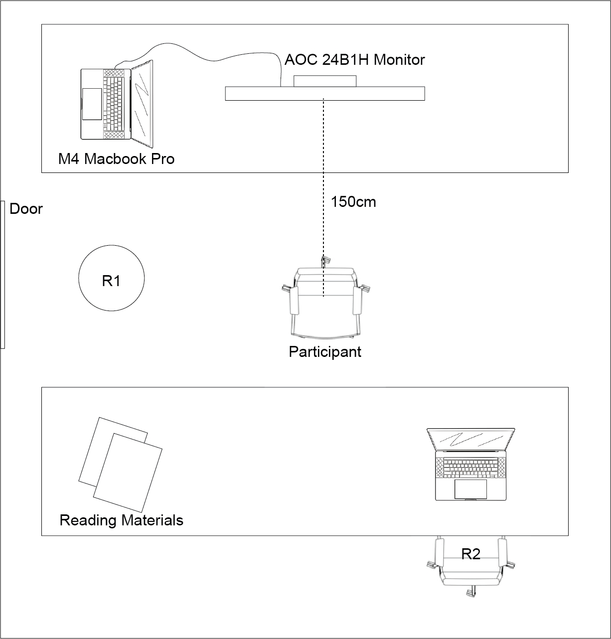
Out of the seven participants, three were removed from the study: two cases because the participants had worse vision than our intended study threshold, and one because ACAPO told us we unfortunately had run out of time and had to stop the testing protocol. All participants had their information anonymized according to RGPD standard procedures, signing an informed consent form. For the purposes of the development of this study, participants were assigned a number following a standardized naming structure (P01, P02, P03, etc.).
For the test sessions we ran the following steps:
- Participants signed the forms, and we checked if they were okay, well-rested, needed water, and verified that the distance to the monitor was at 150cm.
- We asked participants to describe their visual impairment as a primary self-diagnosis, asking if their condition was stable and if they used any type of equipment to correct their vision (if yes, we asked them to put it on).
- We ran an ETDRS test and a Pelli-Robson test in a qualitative way to better understand their vision, followed by a speed reading test using two materials: a newspaper (Jornal de Notícias) and a magazine (National Geographic).
- We ran the previously described staircase protocol and finalized the session by asking participants a few questions.
Building Dataset 2 (VI-OCR Pipeline)
For Dataset 2, we used the same set of images and ran them through the VI-OCR pipeline, well, actually an adaptation of the VI-OCR pipeline, since we ran into considerable issues with the Python dependencies being broken that we had to fix. As an unbiased tester of the VI-OCR pipeline, this obviously was a major issue that took months of fixing.
We also had to do a few adaptations to the OCR logic, as it was problematic because the AI model was looking for full phrases or words instead of looking for trigrams.
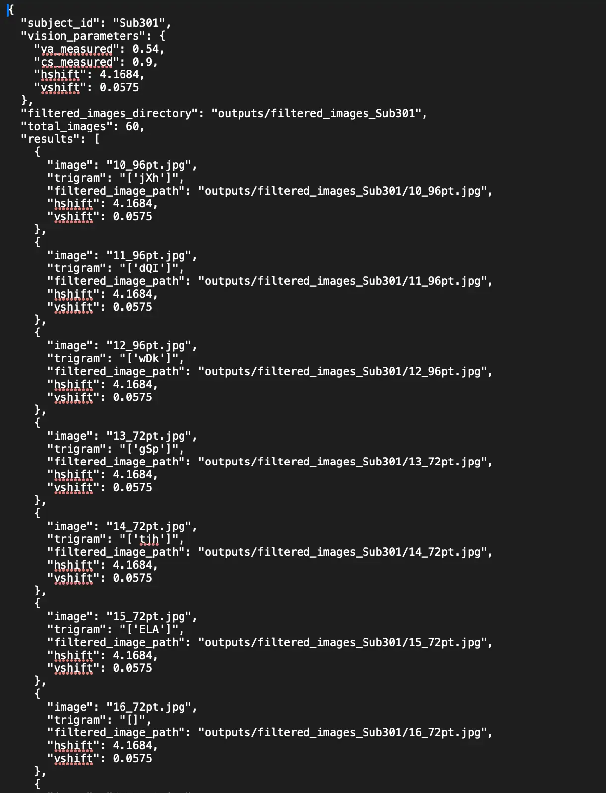 In our workflow, we started with a folder containing the original images, ran the pipeline, and got two outputs: the filtered image and a
.json file containing a text string showing whether or not the pipeline recognized the trigram presented in the image.
For the VI-OCR pipeline, we ran 10 simulations with varying HShift and VShift values following the values from the repository that was made available, removing VI-OCR06, VI-OCR07, and VI-OCR08 because the simulated vision was below our defined threshold.
Data Analysis
The final result was a Google Sheets table that we used for data collection and analysis, which is available online alongside all original and filtered images. From there, we used Google Sheets to create the analysis of the acquired data. The math logic for the different values we generated is explained in the original document, and the Google Sheets table was also made available so other people can replicate our results.
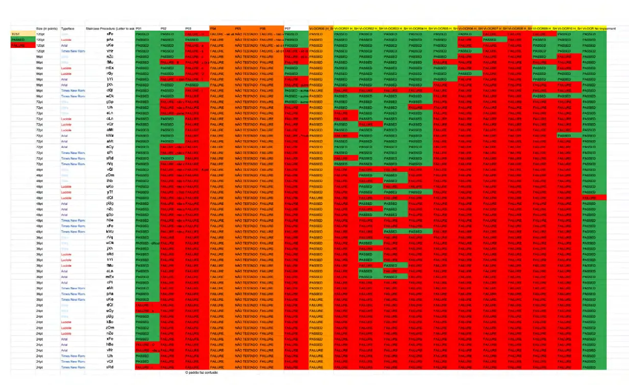
The analysis focused on three complementary values:
- Cohen’s Kappa: Asks how much agreement exists between the human and computational classifications beyond what could be expected by chance.
- P-value: Helps determine whether there is a statistically detectable difference between the two sets of results.
- MAE and MSD: Mean Absolute Error (MAE) and Mean Signed Deviation (MSD) allowed me to look at the magnitude and direction of the computational error. This distinction is important because a system can have a reasonable level of agreement while still systematically over or under-estimating human performance.
Results & Analysis
The most important result is that some of the computational profiles demonstrated meaningful agreement with human participant behavior.
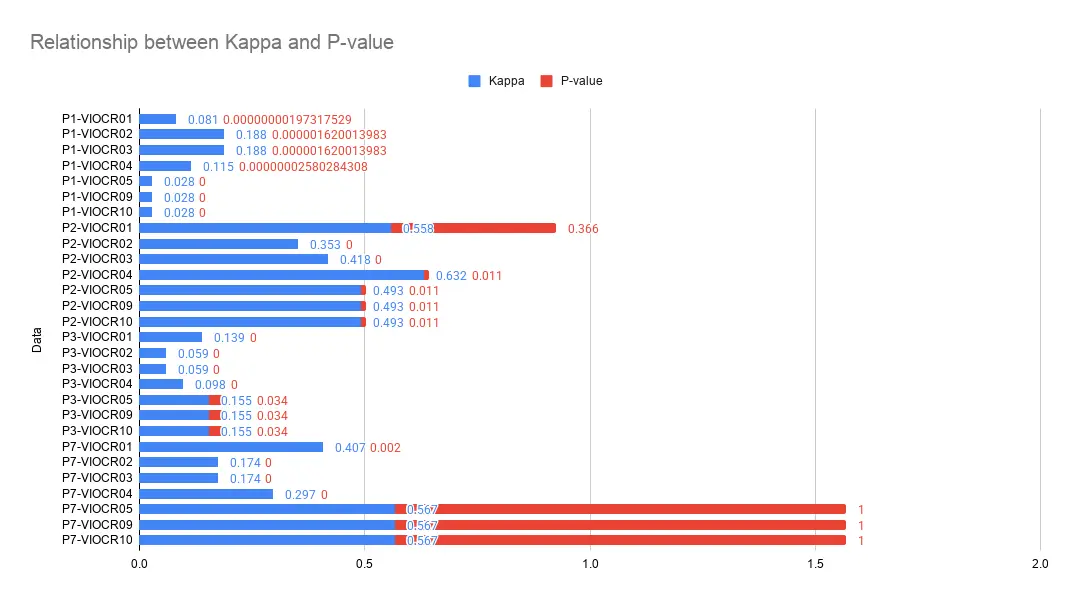
The strongest result was obtained for participant P02 against VI-OCR04, with a Cohen’s Kappa of 0.632 (which corresponds to substantial agreement) and a p-value of 0.011, meaning there was not a statistically detectable difference between the two sets of results.
There were also several other moderate-agreement combinations, particularly involving participants P02 and P07. This is important because it demonstrates that the simulation was not simply producing random recognition errors. Under certain configurations, its pattern of failures aligned measurably with the human participant.
However, the results also show a very important limitation: The agreement was not universal. While P02 and P07 produced the strongest results, other participants showed substantially weaker correspondence. Participant P03, for example, produced Kappa values ranging from approximately 0.059 to 0.155 across the simulation profiles. This means I cannot conclude that one VI-OCR configuration can represent visually impaired vision in general. Instead, the results suggest that calibration to specific visual conditions is critical.
Typeface Performance
Although we didn’t have a very large sample, I also examined the performance of each typeface:
- Luciole showed comparatively strong recognition performance, which is particularly interesting because it was specifically designed with accessibility in mind.
- Sitka produced one of the lowest Mean Signed Deviation (MSD) values, suggesting a relatively balanced relationship between simulation and human performance.
- Arial produced the highest Mean Absolute Error (MAE), indicating greater divergence overall.
- Times New Roman produced the highest positive MSD, suggesting that the simulation tended to underperform relative to the human participants for this typeface.
Note: its important to reinforce that these results are more of a curiosity than actually fully representative of how each typeface performed, since our sample wasn’t big enough to reach these types of conclusions.
What do these results actually tell us?
Taken together, the results give us a more nuanced answer than simply saying that the VI-OCR pipeline works or doesn’t work. The data shows that the pipeline can approximate human recognition behavior under certain calibrated conditions.
But they also show that calibration is critical, and that different visual conditions can produce very different outcomes. This makes sense because visual impairment is not a single perceptual state, as we identified with our test protocol and the questions asked to each participant. And, importantly, OCR does not perceive the world in the same way that a human does. Humans can use context, prior knowledge, adaptation, and semantic prediction in ways that an OCR system does not reproduce.
So I don’t interpret these results as validating VI-OCR as a replacement for human testing. Instead, I see its strongest potential as a computational pre-validation tool that could allow designers to explore and eliminate some possibilities before moving to human testing, which can, in turn, accelerate development and even allow testing sessions to not be as intense for the participants.
What does the industry think about VI-OCR?
For my dissertation I reached out to a variety of type designers, researchers and other relevant people in the industry. These interviews or inquiries I did are all attached in the final document I’ve linked above. I genuinely believe it’s one of the most interesting parts of my dissertation, so please, do take a quick look.
These inquiries broadly reinforce this interpretation. There appears to be interest in computational accessibility tools because they could provide type designers with faster and more repeatable feedback during the design process.
However, the professionals I approached also raised an important concern: a computational metric should not become a proxy for human experience. So the most realistic role I see for a tool like VI-OCR is as an additional layer within the design workflow, something that helps identify promising or problematic directions, while human testing remains necessary for validation.
A quick note that I wanted to put here is that I’ve had the pleasure to present my work to a few incredible people at Google, including Dave Crossland, Hilary Palmén, and more. They all agreed with this and we had a wonderful discussion about the possibilities of this kind of technology.
This could be in the form of a plugin for Glyphs or even a standalone website. From the conversations I had, I genuinely believe the possibilities are endless.
What do visually impaired people think about VI-OCR?
In the same light, the interviews I did with each visually impaired participant showed a genuine enthusiasm, not fear against a tool like this, but rather an appreciation for the research and curiosity about its impact on their day-to-day lives.
So, can VI-OCR simulate human impaired vision?
Returning to my main research question, I would say that the results provide evidence that VI-OCR can generate legibility metrics that meaningfully correlate with human participant data under certain conditions. However, the results do not support universal reliability across different visual impairment profiles. Therefore, I consider the hypothesis to be conditionally supported rather than universally confirmed.
Contributions
I would summarize the contribution of this dissertation in four areas:
- Scientific: Provides a direct comparison between computational recognition and human participant data.
- Methodological: Implements and documents a VI-OCR-based experimental workflow and an adaptation to the staircase protocol.
- Type Design: Researches how different typefaces behave under simulated visual impairment.
- Applied: Explores whether computational legibility testing could have a place within professional type-design workflows.
Limitations
There are also important limitations to keep in mind:
- Sample Size & Clinical Depth: The human sample was small, and the participants’ visual conditions could not be clinically characterized in the depth that would be possible with specialist optometric involvement.
- Technical Scope: The computational experiment was limited to one VI-OCR architecture and one OCR engine (Gemini).
- Controlled Environment: The execution of the test protocol took place under controlled conditions, so the findings should not be extended automatically to more complex environments involving motion, glare, dynamic interfaces, or prolonged reading.
These limitations are, of course, very important because they define the scope of what this dissertation can actually claim.
What about VI-OCR as a software pipeline?
A big part of this dissertation was to act as a third party to implement and test software that wasn’t developed by myself. As an absolutely unbiased third party, VI-OCR isn’t ready to be released to the general public yet.
Their version of the tool in their repository was, as previously mentioned, problematic to run. Hopefully, my research is used to further refine VI-OCR and to release it in a much better state to an industry and people that I’m sure will greatly value and be impacted by it.
After defending my dissertation, making a few changes to the final document and releasing my research through the official University repository I contacted Dr. Xiong and Dr. Gao to present my results, they updated me regarding their research as well, confirming they were working on a new improved version of VI-OCR.
Conclusion
Ultimately, I don’t think the contribution of this research is demonstrating that a machine can replace people with visual impairments. The more useful conclusion is that computational simulation may provide a new layer between type design and human testing. A designer could potentially design, simulate, iterate, and then validate with human participants.
If developed further, this could make accessibility-oriented typeface research more scalable without removing the human experience from the process. So the future I see is not human testing versus computational simulation. It’s human testing supported by computational simulation.
I definitely would recommend you to check out the conclusion on my original document as well, as it expands with more ideas on this and other relevant adjacent topics.
On a final note
A little bit over a year ago, when I first began my dissertation, I would never have imagined I would get anywhere close to where I am now. A lot of it came to be because I was unafraid of taking the first step, putting myself out there, and reaching out to people I considered heroes. I was afraid they were going to judge me, and maybe think less of me because I wasn’t “good enough”.
One of the first people I really connected with was Dave Crossland. We exchanged a few emails, and he was incredibly kind, offering to help and answer every question I threw his way. That interaction gave me the courage to reach out to more people, making it one of the most impactful moments of my career. First, it gave me the validation and confidence I needed to keep going. Second, Dave introduced me to Octavio Pardo, who has since become both a close friend and a massive influence on my career. Without Dave, I never would have met Octavio; without Octavio, I wouldn’t have had such an incredible mentor. In turn, much of this dissertation wouldn’t exist, and I never would have had the opportunity to present my work to a part of the wonderful team at Google.
This is but one example of the many friendships, their subsequent ramifications, and how they have helped and will continue to help in my journey.
To all of the people that I’ve ever had the pleasure to reach out and talk with, to all of you that gave me time and insights: I am forever grateful and I deeply appreciate what you’ve done for me.
I will leave you with the recommendation to read the full list of acknowledgments I have in the final document of my dissertation. Hopefully, one day, I get to give back to others as much as this community has given me.
References
Beier, S. (2012a). Constituent parts of letters. In Reading letters: Designing for legibility (pp. X–Y). BIS Publishers.
Beier, S. (2012b). Reading letters: Designing for legibility. BIS Publishers.
Carvalho, H. M. S. (2026). Computational simulation models in typeface legibility research [Master’s dissertation, University of Porto]. Repositório Aberto da Universidade do Porto. https://hdl.handle.net/10216/176710
Cheng, K. (2005). Designing type. Yale University Press.
Gao, Q., Manduchi, R., Ramulu, P., Legge, G., & Xiong, Y. (2025). VI-OCR: “Visually impaired” optical character recognition pipeline for text accessibility assessment. Research Square. https://doi.org/10.21203/rs.3.rs-7032700/v1
Holmes, K. (2018). Mismatch: How inclusion shapes design. MIT Press.
Larson, K., & Carter, M. (2016). Sitka: A collaboration between type design and science. In [Book title] (pp. 37–53). World Scientific. https://doi.org/10.1142/9789814759540_0003
Lupton, E. (2010). Thinking with type: A critical guide for designers, writers, editors, & students (2nd ed.). Princeton Architectural Press.
Napoleão, E. (2021). Identidades tipográficas: Modelo de suporte ao projeto tipográfico para lugares [Master’s dissertation, University of Porto]. Repositório Aberto da Universidade do Porto. https://hdl.handle.net/10216/141626
Noordzij, G. (2005). The stroke: Theory of writing (P. Enneson, Trans.). Hyphen Press. (Original work published 1985)
Unger, G. (2018). Theory of type design. nai010 publishers.
World Health Organization. (2019). World report on vision. https://www.who.int/publications/i/item/9789241516570